Service Company Website & Landing Page Campaign
Reconfiguring a One-Page Website into a Comprehensive Business Platform
My Role
UX Designer
UI Designer
Full-Stack Developer
Team
SEO Researchers
Content Writers
Business Owner
Tools
Figma
Photoshop
WordPress
Timeline
2.5 Months
2023
Client/Industry
Safer Home Services LLC
Mold/Water Damage Remediation
We created a website that is
educational,
caters to emergency service,
promotes trust,
& simplifies a stressful experience.
The Design Process Begins...
Woohoo, let's jump right in
Understanding the Client
This step goes without saying, but here were our resulting goals:
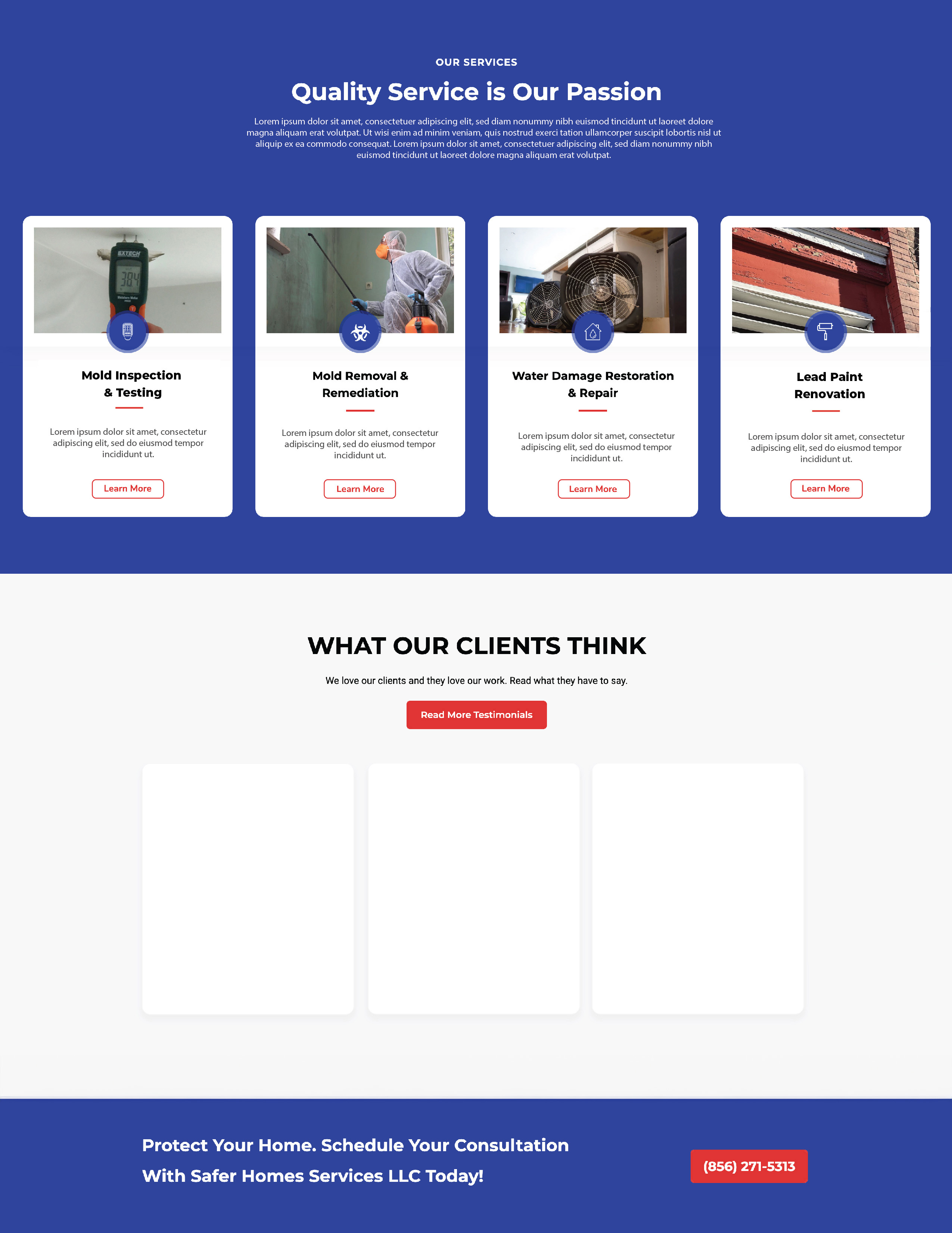
- Provide detailed information about the company's services
- Provide public health information and why their services are important
- Create a user-friendly platform that promotes trust and caters to those in emergency situations ie. a flood
- Provide a clear path for users to contact for, or inquire about, services
- Drive new, local users to the site by use of SEO best practices and optimized content
Let's Create Some Visuals for the Team
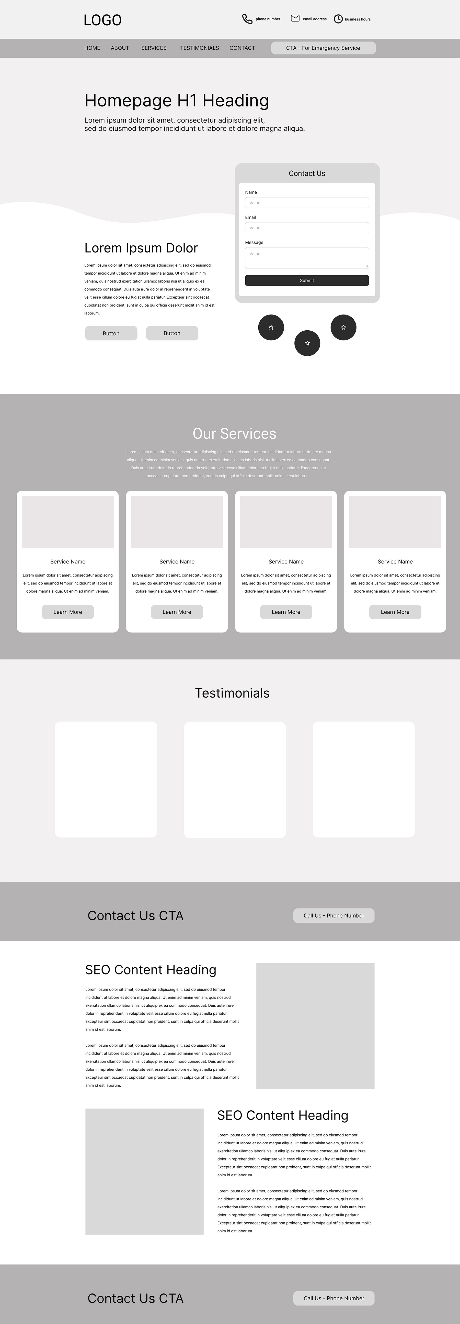
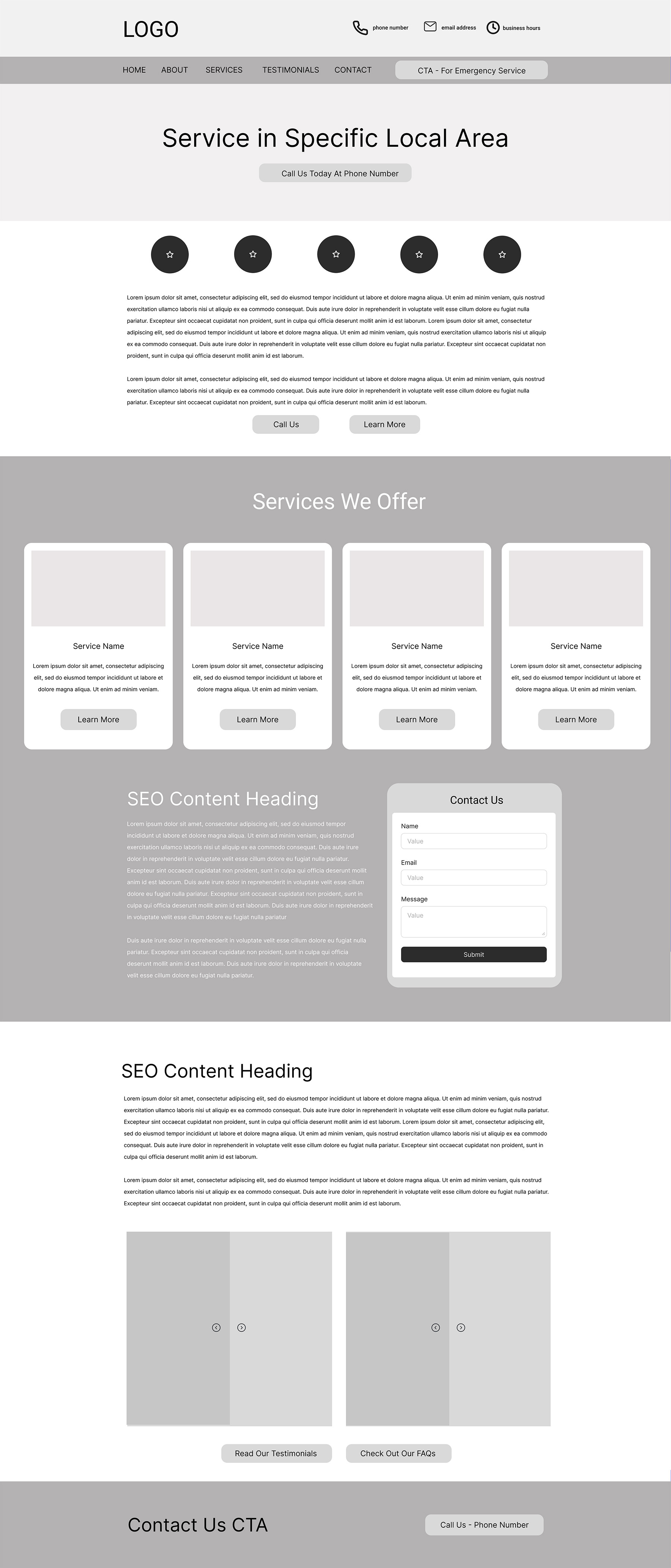
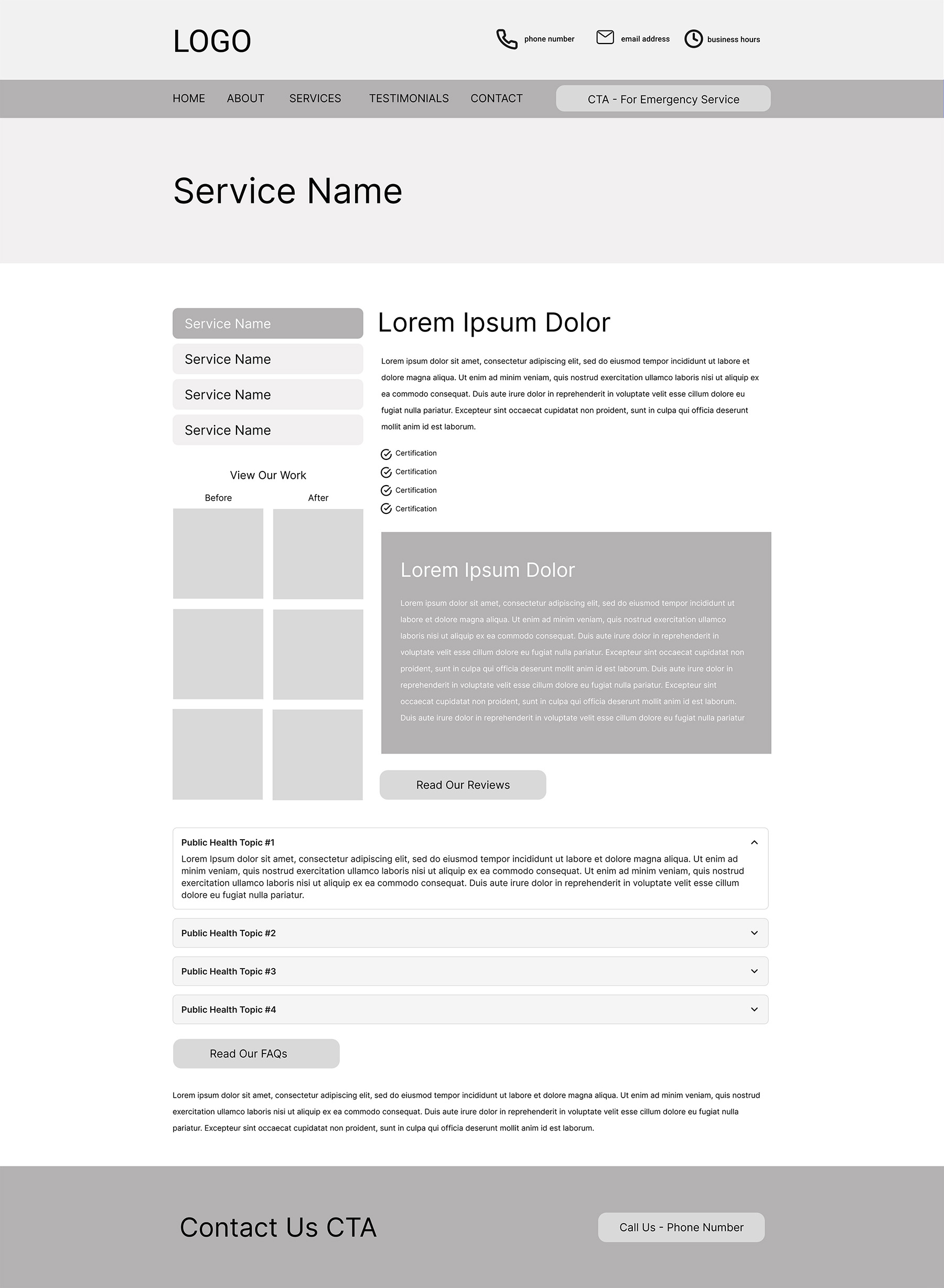
Here are wireframes for the homepage and an SEO location-targeted page.
Where My Expertise Was Tested
Where's the fun without a challenge?
Understanding our Goal
We aimed to position our client as the most helpful and transparent company in their industry by including detailed descriptions of their services, timelines, certifications, as well as public health insights, such as when to seek treatment for mold or water damage. Our content team integrated these topics with SEO keywords and created content for each targeted page.
Managing Text in Design
As the designer and developer, I was tasked with creating a web design that effectively presented the content while catering to users in stressful situations. The challenge was to organize the information in a way that appealed to quick decision-makers skimming competitor sites for a service company.
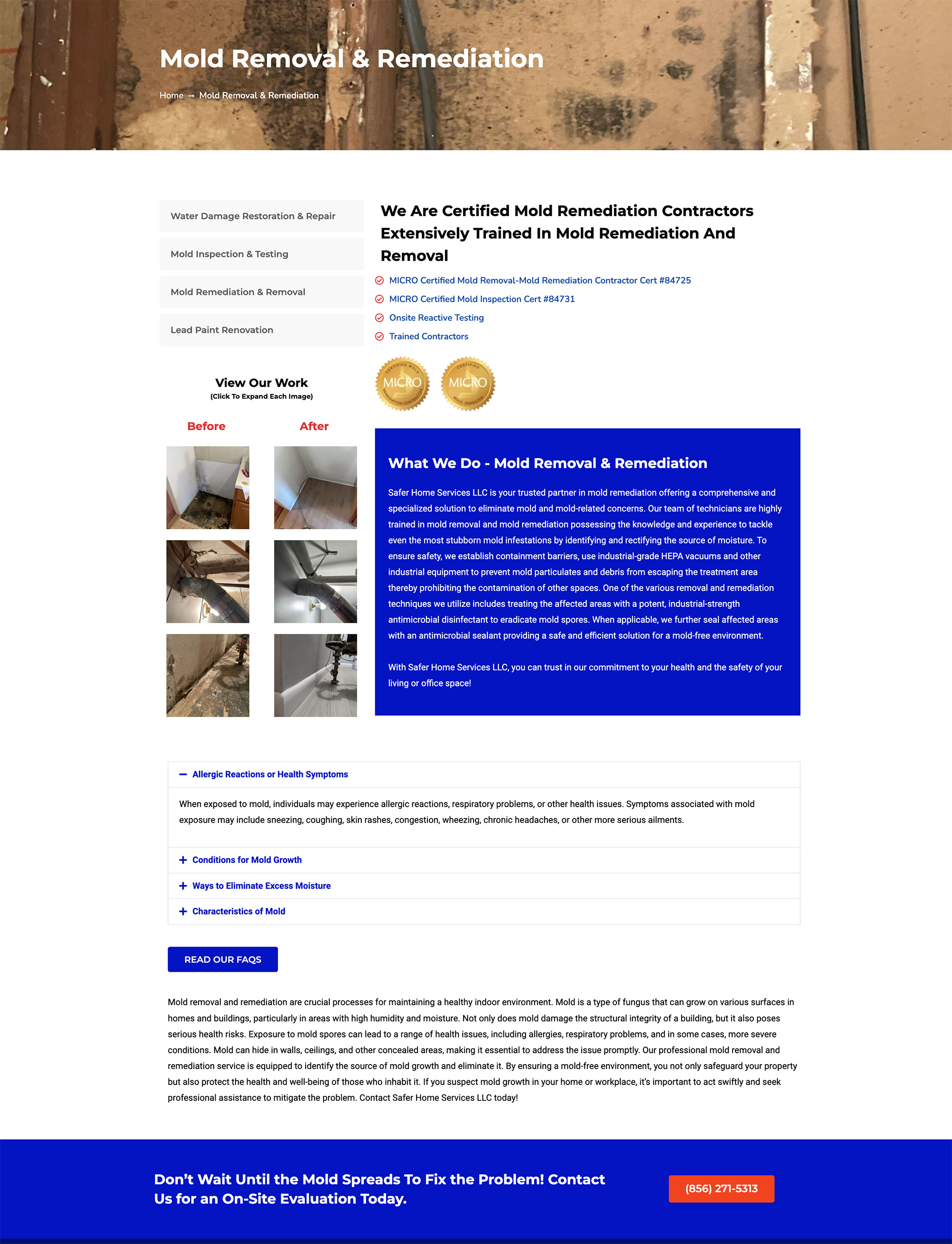
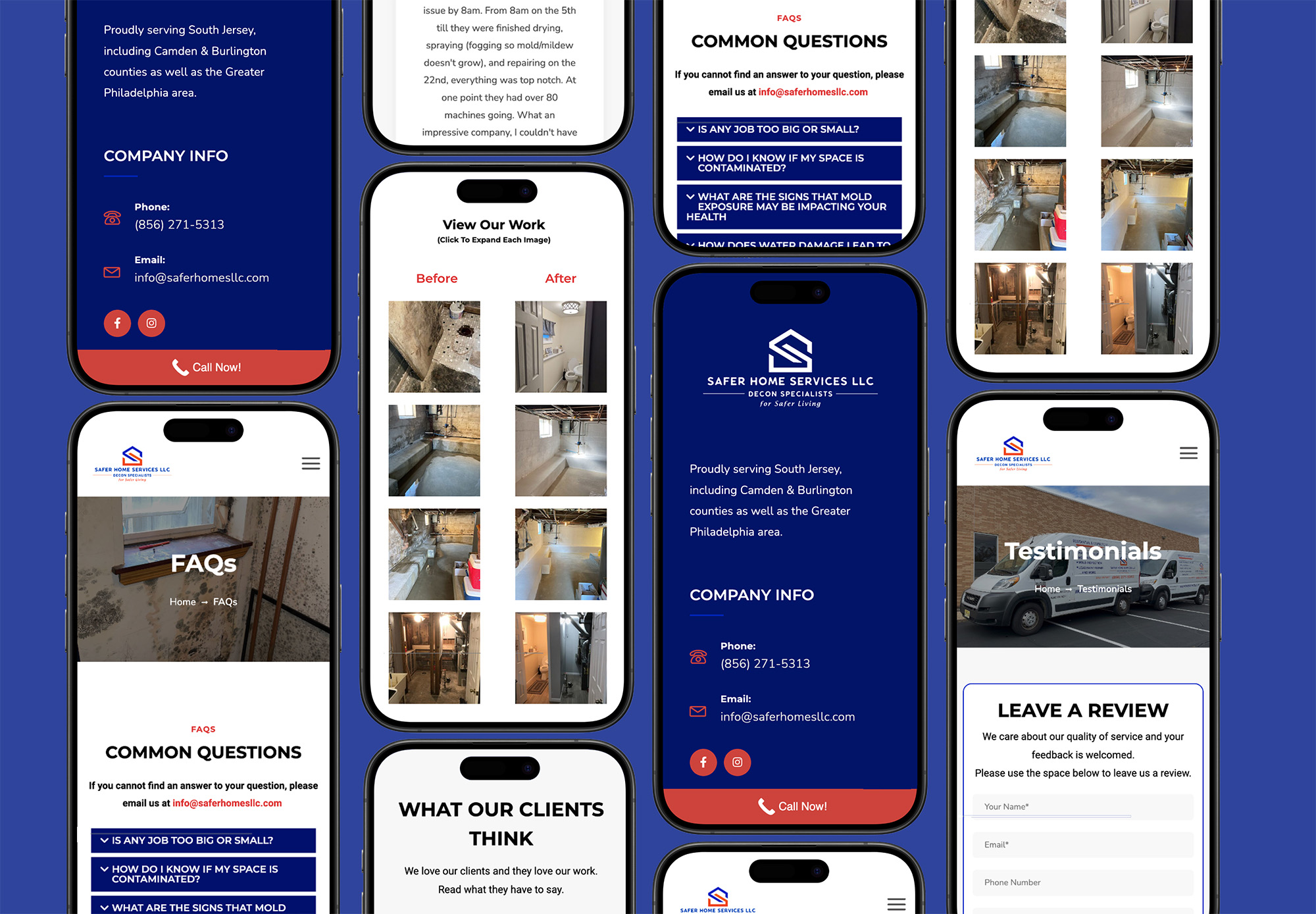
Creating Brand Trust
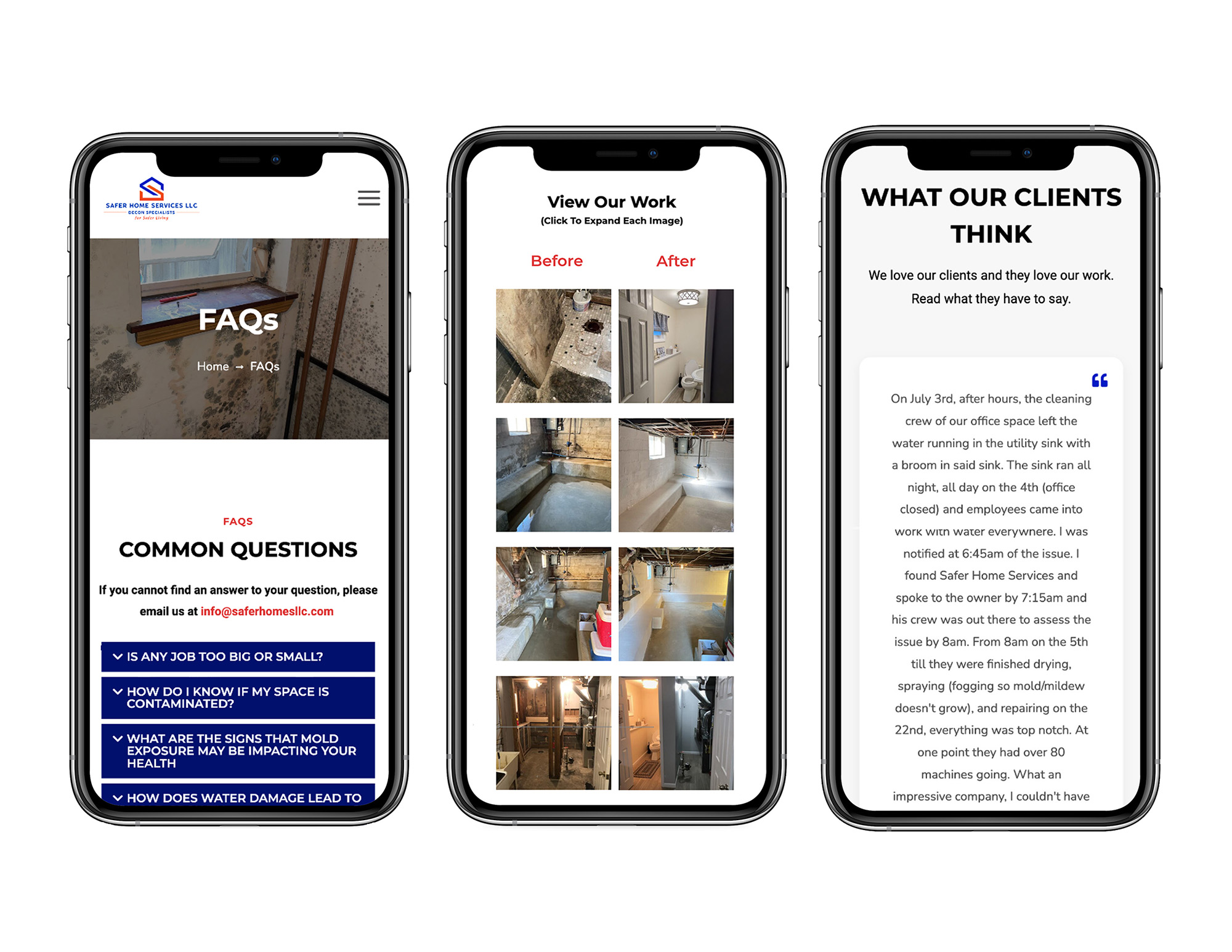
FAQs help users quickly find the answers they are looking for.
Before-and-after images from past projects allows users to connect with the client's work.
Testimonials take the guesswork out of finding quality service.
Each of these things fosters empathy and trust with potential clients. This makes them feel more comfortable reaching out and confident that this business can deliver the services they need.
How I Got To The Final Design Stage
Let's back up a bit...
Every Website Needs A Backbone
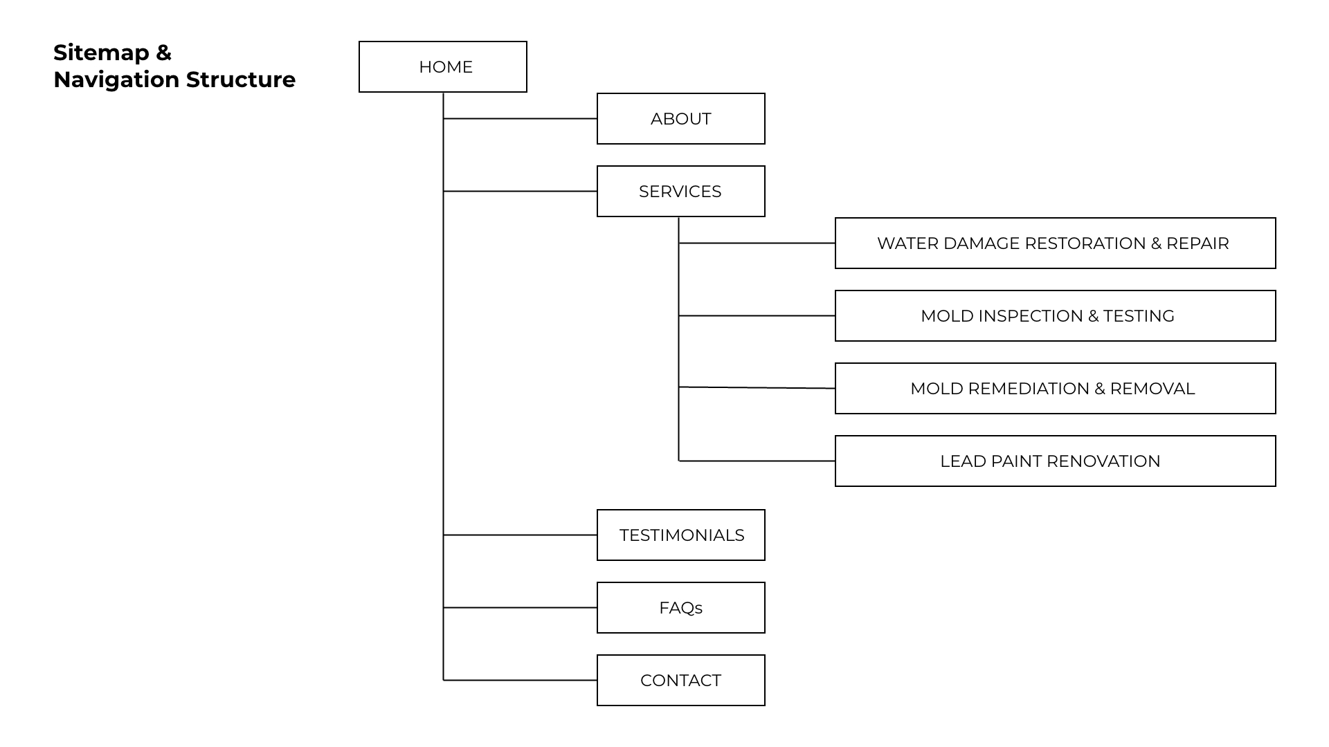
One of the most significant improvements was transitioning from a single-page website to a multi-page structure. The new site architecture provided clear, easy-to-follow navigation.
While we aimed to expand the site, we prioritized featuring the most critical information and clear CTAs on the homepage to reduce click count, accommodating the potential urgency for fast service.
Every Website Needs A Personality
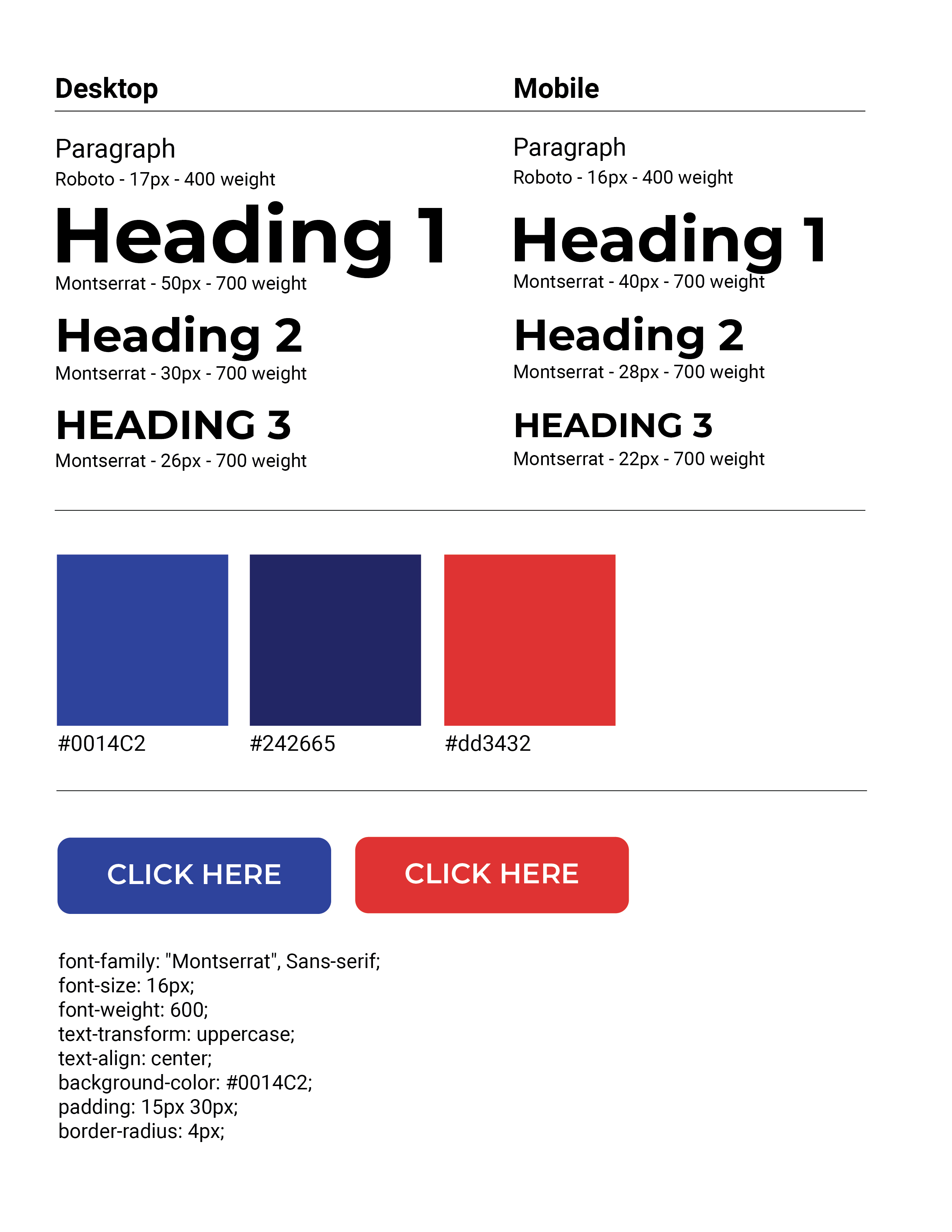
The client had a blue and red color scheme tied to their logo, so I incorporated these colors throughout the design as accents, ensuring they were bold yet balanced. I maintained a minimalistic style to prevent the colors from overwhelming the user, focusing on clean typography and plenty of white space to enhance readability.
Now For The Techy Stuff
How did I build this you ask?
Technical Considerations
I chose WordPress with an Elementor theme for its flexibility and ease of use. This ensured that the client could manage their website in the future without needing extensive technical knowledge.
Development involved:
- Performance optimization: Image compression, CSS/JS minification, and lazy loading for fast load times
- SEO improvements: On-page SEO techniques like meta descriptions, optimized titles, quality content, and schema markup
- Mobile responsiveness: Ensuring that the site delivered a consistent, fully functional experience across all screen sizes
- Database storage for form submissions: Capturing and securely storing form data for easy access and management
I Think It's Ready To Launch! (Testing)
Before launching the site, I conducted rigorous testing:
- Browser compatibility across Chrome, Firefox, Safari, and Edge
- Performance testing using Google Lighthouse, with a focus on improving load times and page speed
- Accessibility checks to meet WCAG standards, ensuring the site was inclusive for all users
After thorough testing, the site went live. I also provided the client with training and documentation to manage and update the website independently.
We Can't Forget the Numbers
Da-da-da-da! The Results...
The final website achieved all the set goals:
- Clear, compelling CTAs: The addition of clear contact options, combined with SEO best practices, resulted in a 30-40% increase in phone calls and form submissions in the first 90 days.
- Built trust: By incorporating real project photos, testimonials, detailed service information, and a professional design, the site effectively built trust with potential customers.
- Simplified user experience: The multi-page structure made navigation easier, helping users find the information they needed quickly.
- Responsive design: The website functioned seamlessly across devices, improving the mobile experience and driving engagement.