Autism Services Website & Landing Page Campaign
Website Redesign and Implementation Focused on Organic Growth
My Role
UX Designer
UI Designer
Full-Stack Developer
Team
Marketing Specialist
SEO Researchers
Content Writers
Project Managers
Tools
Figma
Photoshop
WordPress
Timeline
4 Months
2023
Client/Industry
Helping Hands Family
Autism Therapy
We created a website that is...
accessible,
informative,
suggestive (describes benefits),
& focuses on organic local growth.
The Design Process Begins...
Woohoo, let's get into it
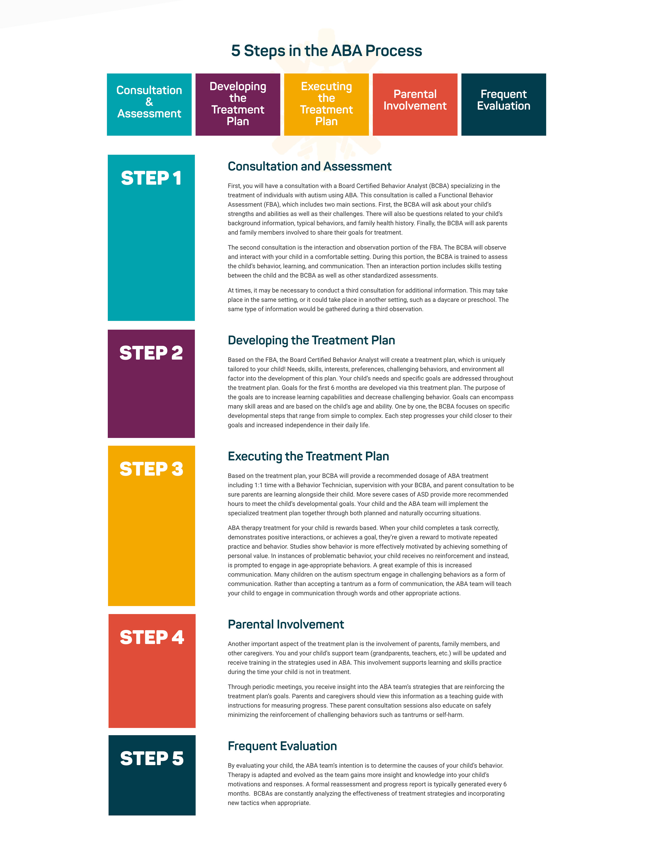
Getting Our Hands Dirty
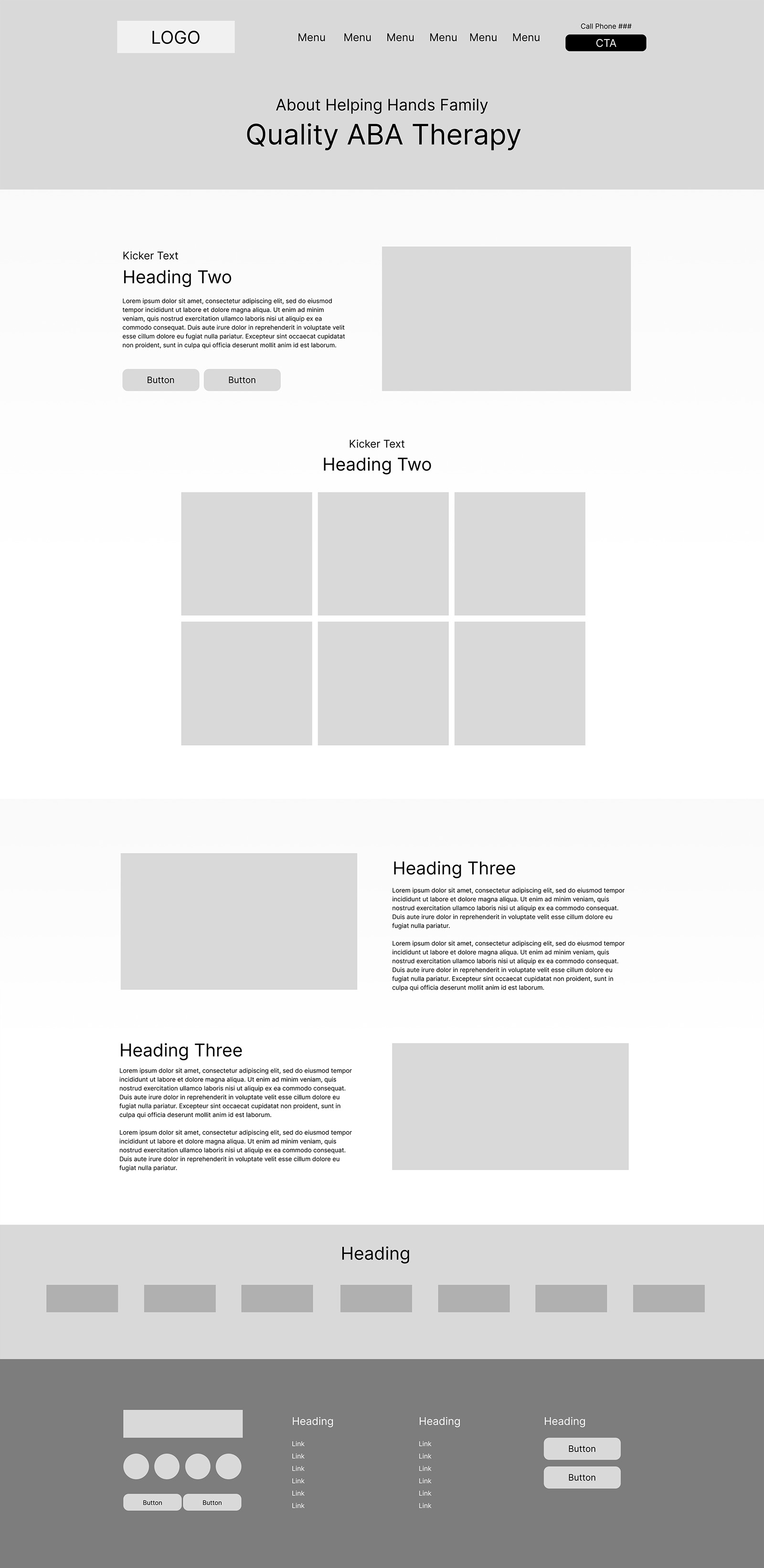
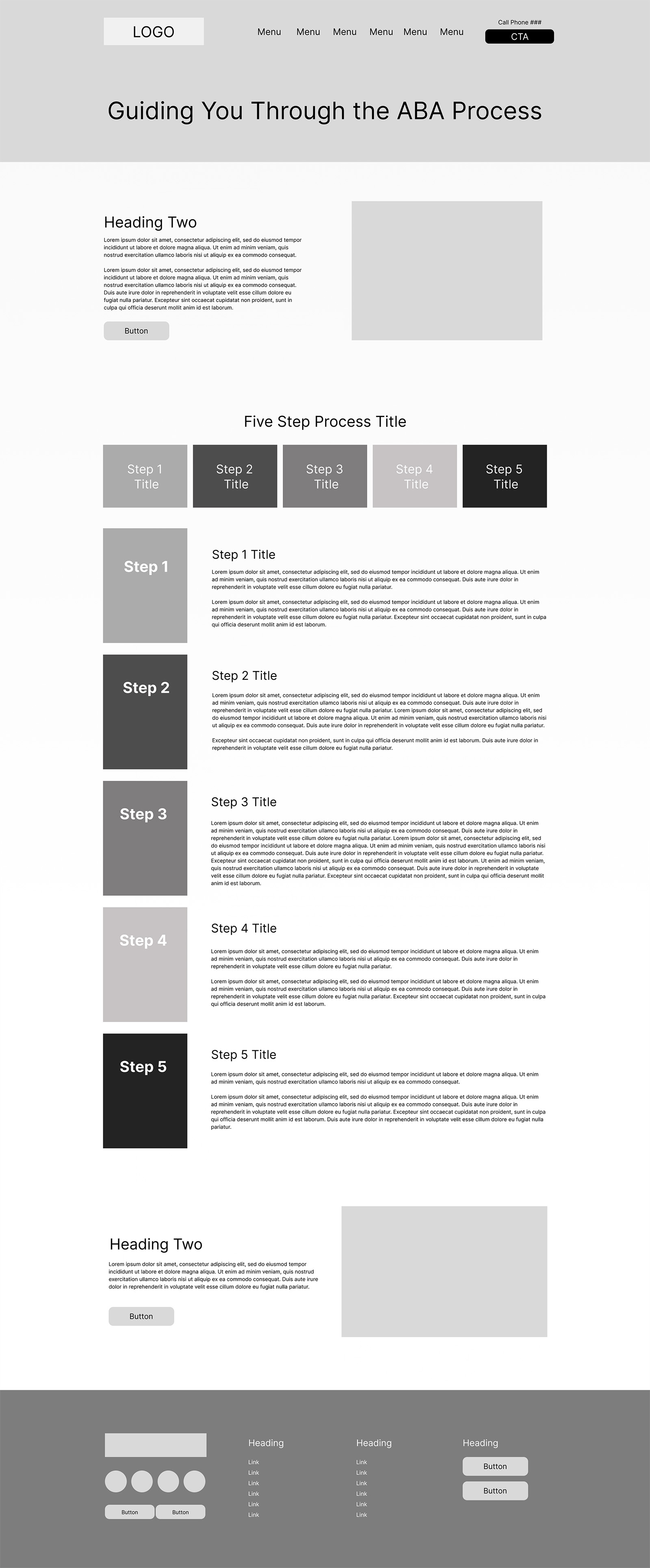
I like to "start" by designing the real meat of the project. This gives myself, my team, and stakeholders an idea of what to expect from the final product, as well as an early opportunity to provide feedback.
First up are wireframes (and then prototypes) of an About page and a Process page.
Did Anything Go Wrong or Need To Be Changed?
Of course it did... that's the nature of design!
Understanding the Campaign
The campaign involved creating 50+ landing pages targeting specific towns within this company's target audience. I worked with an SEO researcher and writer who created the content for these pages.
Addressing User Confusion and Potential Misinformation
Misinformation!? Yikes...
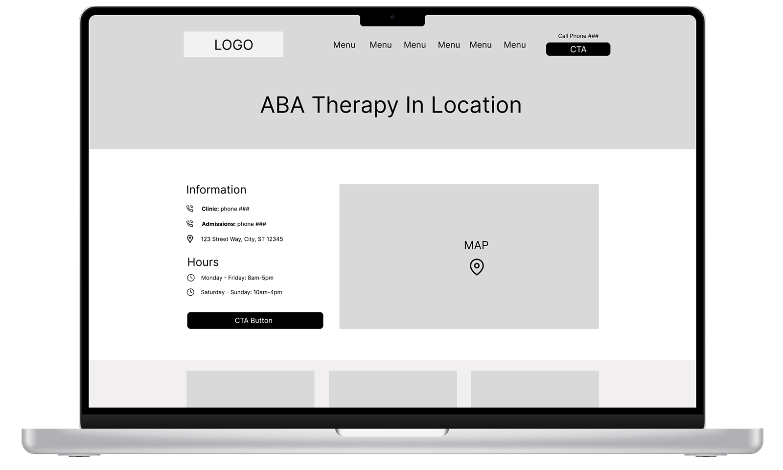
We identified a critical oversight: the content strategy implied that the client had physical facilities in all areas targeted in the campaign. However, for many of the targeted areas, the closest facility is in the next town over. Therefore, the phrasing "ABA therapy in [specific town]" risked misleading users or causing confusion.
This presented a significant challenge, as the SEO team had already completed the URL structure, page plans, and written content for the 50+ page campaign... yikes again! Instead of panicking or having the team overhaul their work, I stepped back, assessed the broader needs, and proposed a scalable solution that required minimal rework, improved user clarity, and preserved the original campaign strategy.
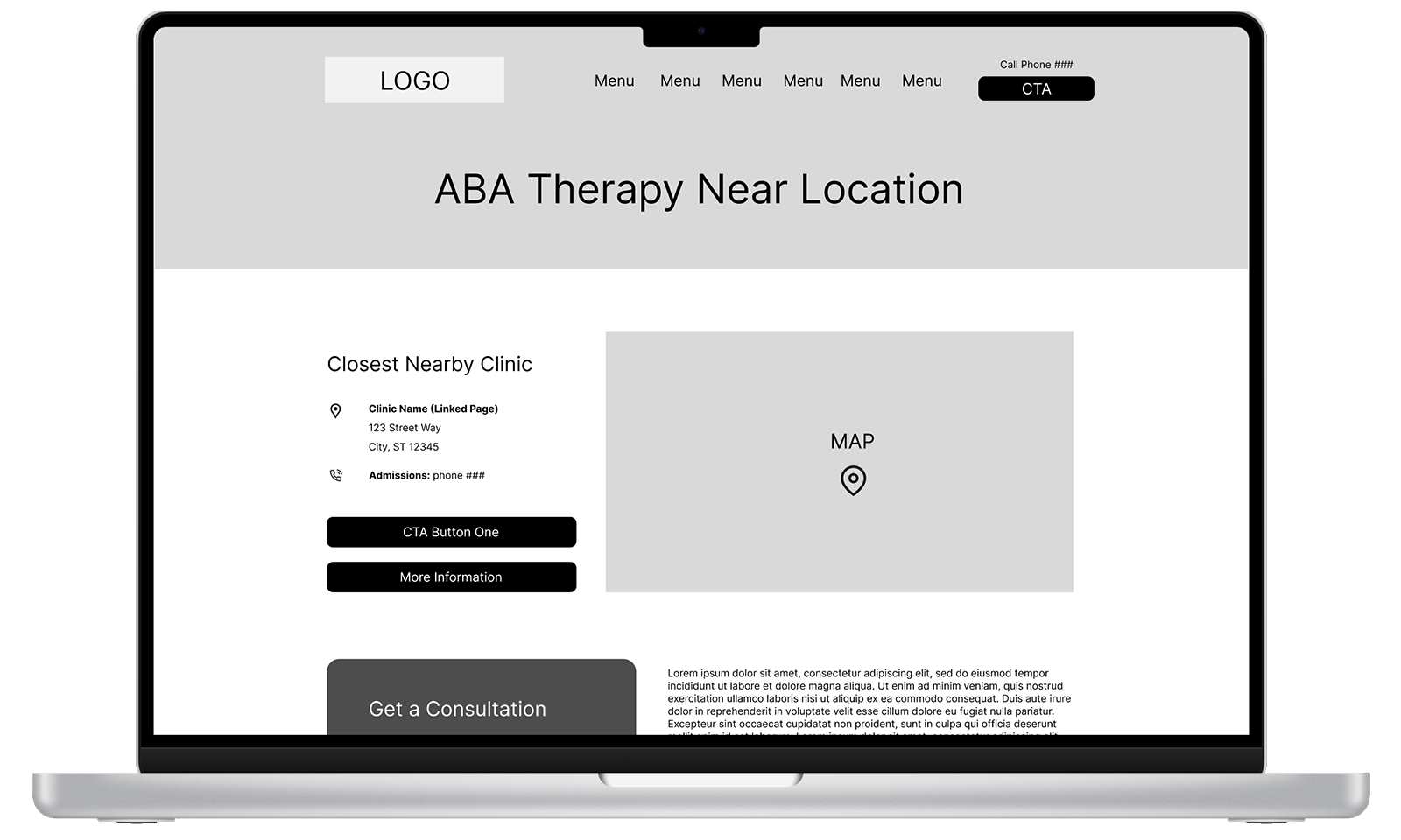
We revised the language to emphasize proximity, using phrasing like "ABA therapy near [specific town]." Additionally, I recommended adding a list of the closest facilities and an interactive map to each new page.
To implement this, I designed a new layout for these "nearby" facility pages. This solution allowed us to move forward with the campaign as planned, preserving its integrity while improving the user experience and maintaining local relevance.
How I Got To The Final Design Stage
Let's back up a bit...
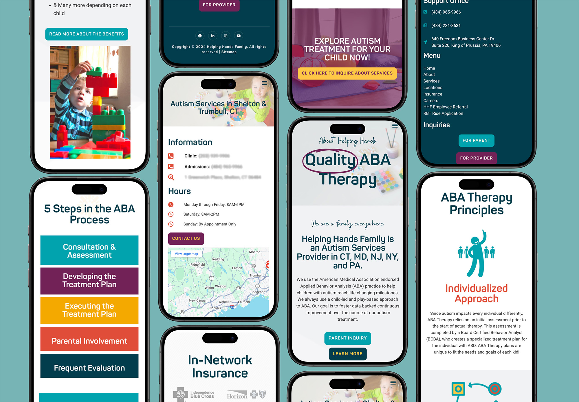
Every Website Needs A Backbone
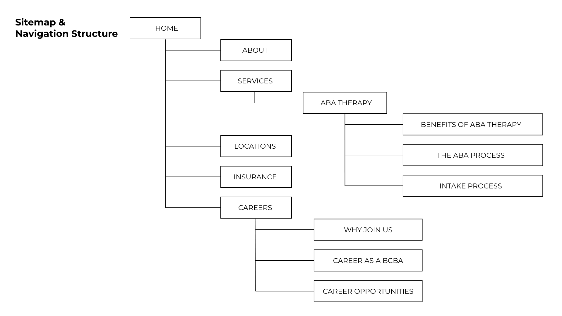
My goal while creating the navigation structure was to provide obvious links to essential information, most importantly, services and facility locations.
While we aimed to expand the site, we prioritized featuring the most critical information and clear CTAs on the homepage to reduce click count, accommodating users that are ready to reach out.
Every Website Needs A Personality
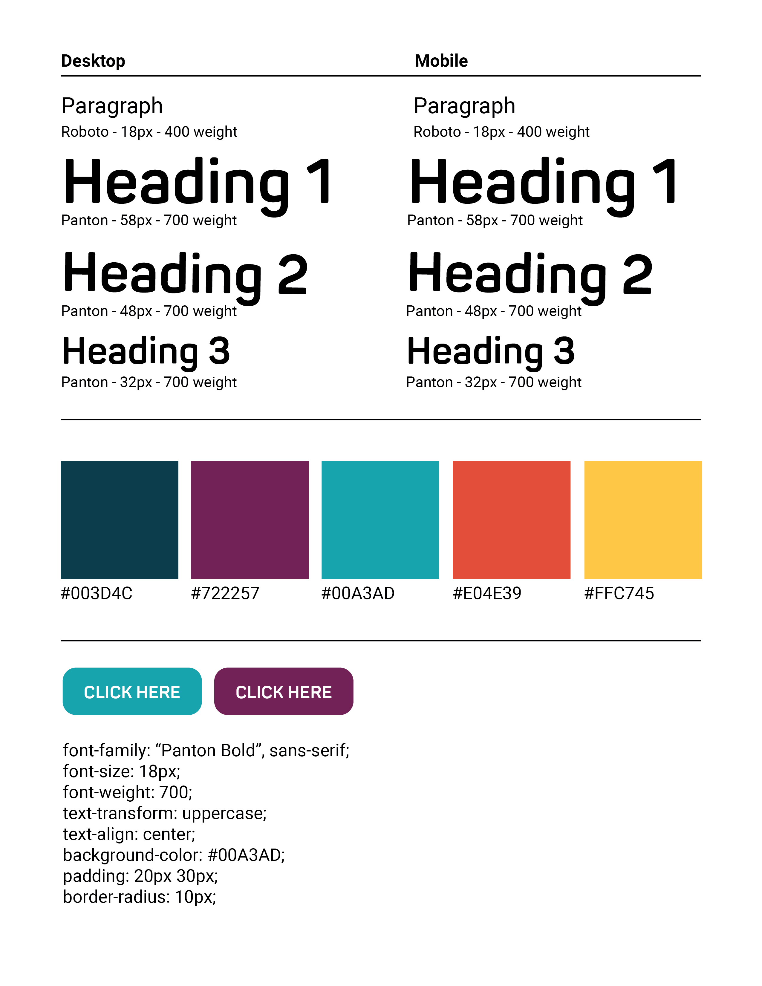
The client had a playful, bright color scheme tied to their logo, so I incorporated these colors throughout the design as accents, ensuring they were bold yet balanced. I maintained a minimal yet fun style to prevent overwhelm and to balance a child-friendly and professional look. I focused on clean typography and plenty of white space to enhance readability.
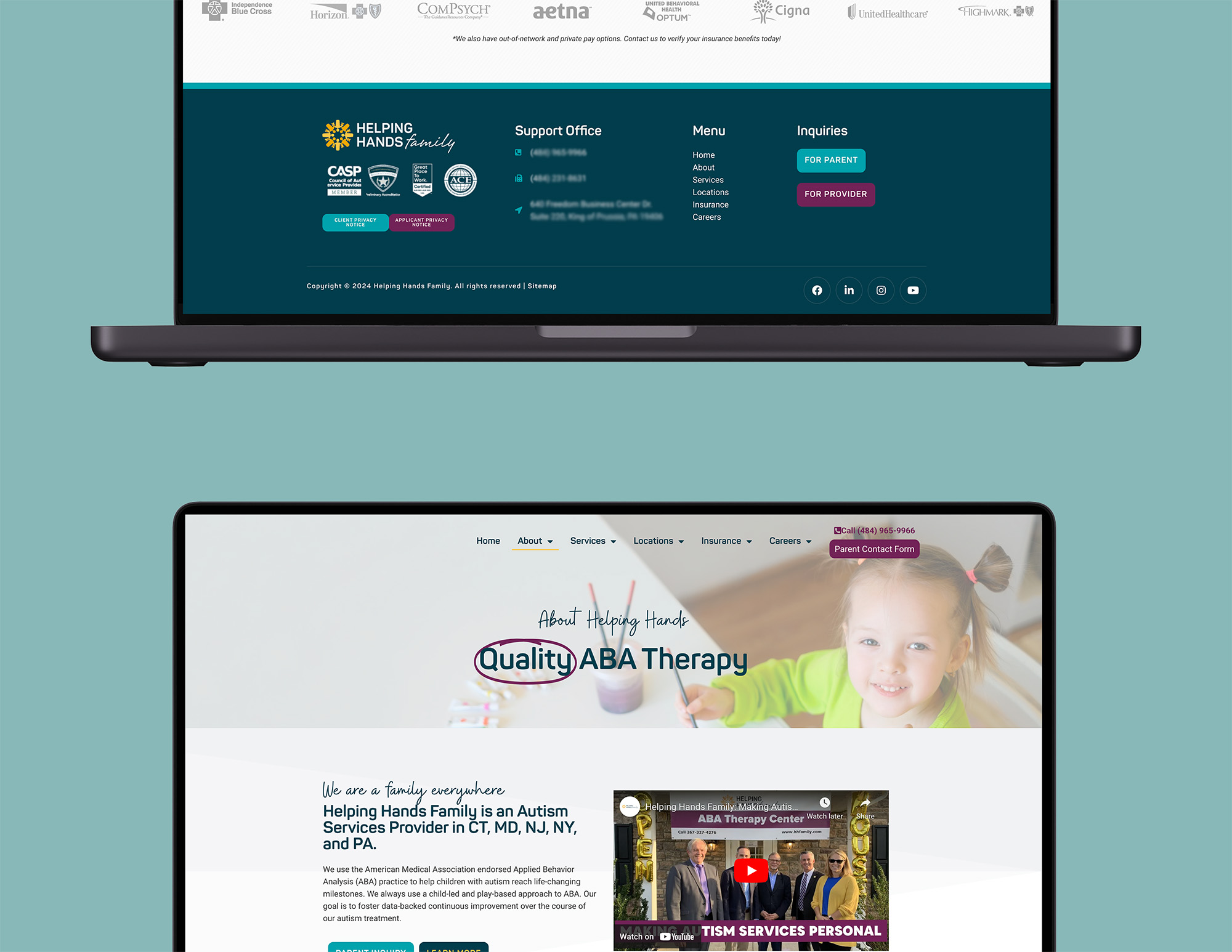
Let's See The Final Design Stage
A little birdy told me you wanted to see prototypes... I'll let you watch these on your own accord
Now For The Techy Stuff
How did I build this you ask?
Technical Considerations
I chose WordPress with an Elementor theme for its flexibility and ease of use. This ensured that the client could manage their website in the future without needing extensive technical knowledge.
Development involved:
- Performance optimization: Image compression, CSS/JS minification, and lazy loading for fast load times
- Accessibility considerations: I added an accessiBE extension to make sure the site is certified WCAG compliant
- SEO improvements: On-page SEO techniques like meta descriptions, optimized titles, quality content, and schema markup
- Mobile responsiveness: Ensuring that the site delivered a consistent, fully functional experience across all screen sizes
- Database storage for form submissions: Capturing and securely storing form data for easy access and management
I Think It's Ready To Launch! (Testing)
Before launching the site, I conducted rigorous testing:
- Browser compatibility across Chrome, Firefox, Safari, and Edge
- Performance testing using Google Lighthouse, with a focus on improving load times and page speed
- Accessibility checks to meet WCAG standards, ensuring the site was inclusive for all users
After thorough testing, the site went live. I also provided the client with training and documentation to manage and update the website independently.
We Can't Forget the Numbers
Da-da-da-da! The Results...
The final website achieved all the set goals:
- New information architecture: The new website structure encouraged site exploration, helping new or returning users learn about the company and their offerings.
- SEO optimizations: Overall best practices along with the implemented SEO campaign resulted in a 40-45% increase in new website users in the first 90 days.
- Clear, compelling CTAs: The addition of numerous, obvious contact options encourages users to reach out whenever they desire to.
- Accessible, responsive, and user-friendly: The website functioned seamlessly across devices, utilized an intuitive flow, and included various accessibility options.